- Reactiescore
- 139
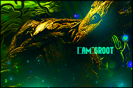
One of my first CoA using photoshop rather than GIMP. Any CnC?
border looks weird to me, in comparison to border than GIMP. Is this the normal procedure to create border on photoshop select>all>select>modify>border>1px>paint black around edge?
particularly struggling to learn how to do good text on photoshop.
")